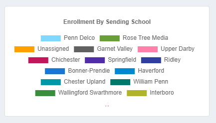
Some dashboard charts that have a lot of information on the legends need to be larger to show the charts🐛Bug ReportsDec 9, 2021Enrollment by Sending School is a good example. If there are too many sending schools, the legend takes up too much space to show the chart.Posted by John Lohr · Dec 9, 2021Status: Completed1 comment1
Log in to comment and vote
Comments1
Cameron Kolick
Jan 25, 2022
Hide the legend